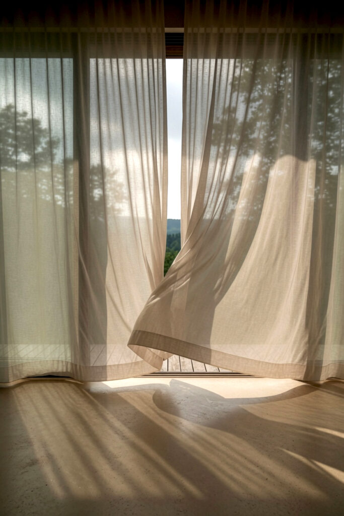
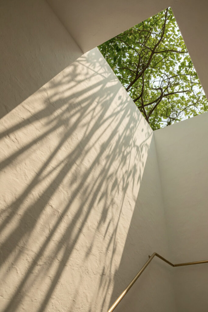
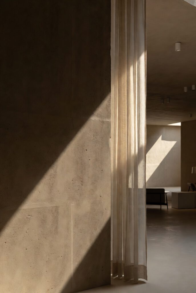
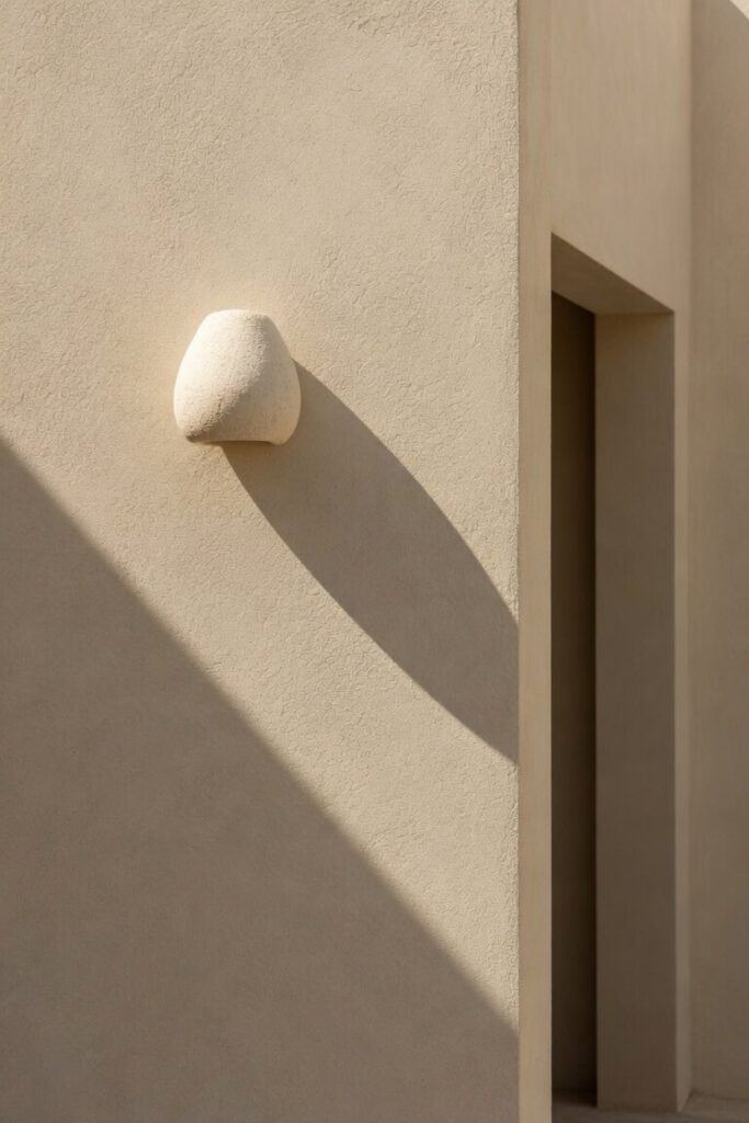
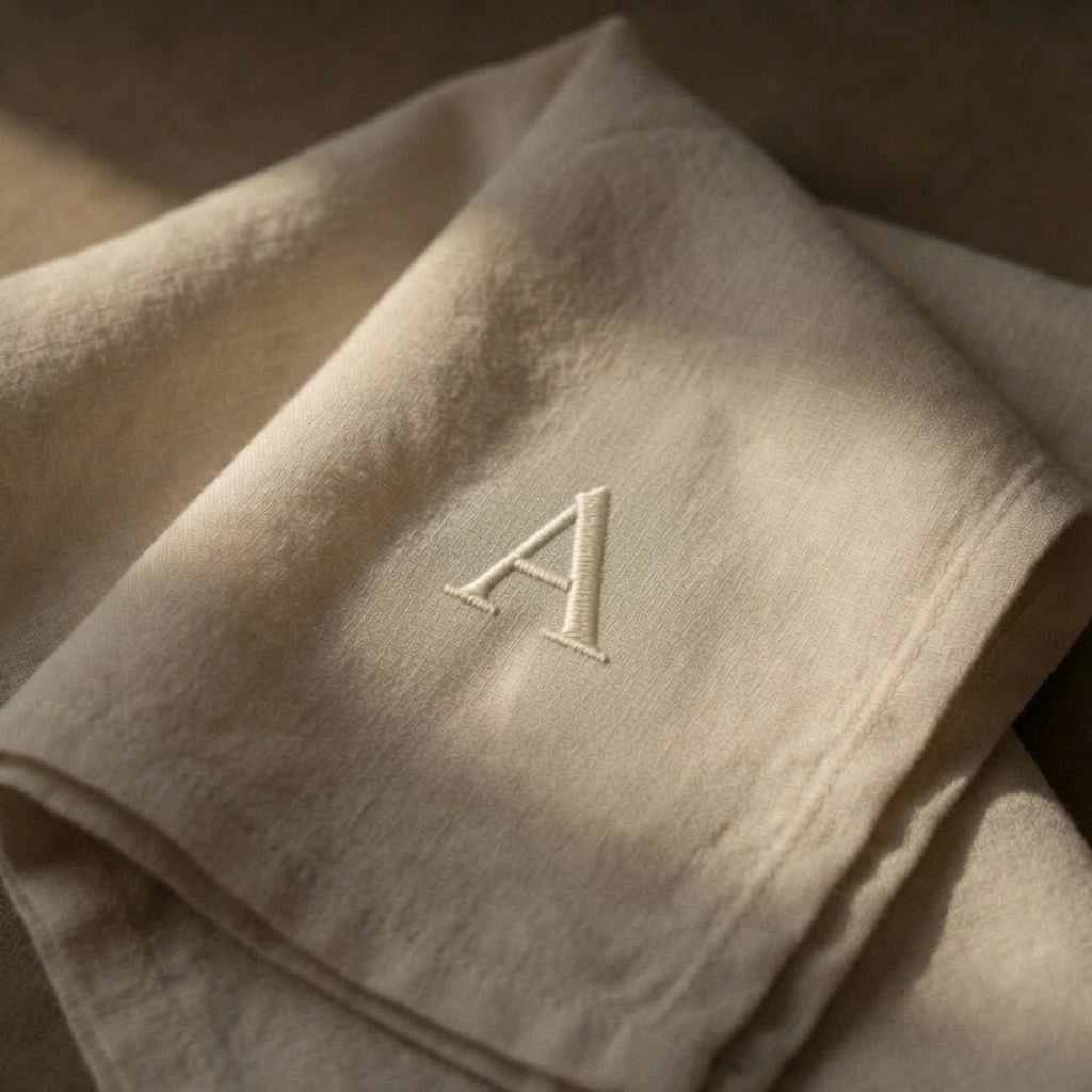
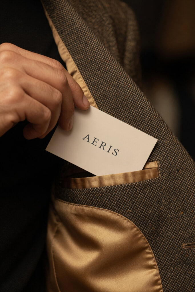
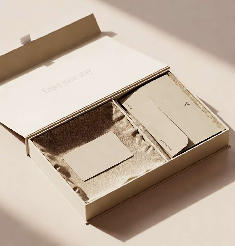
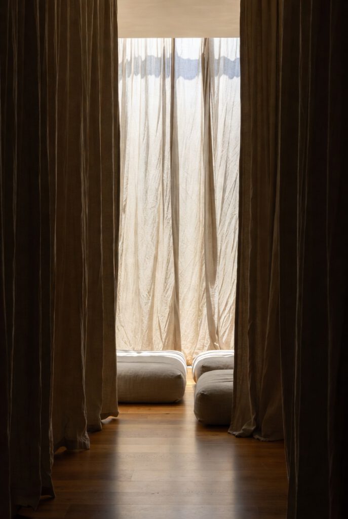
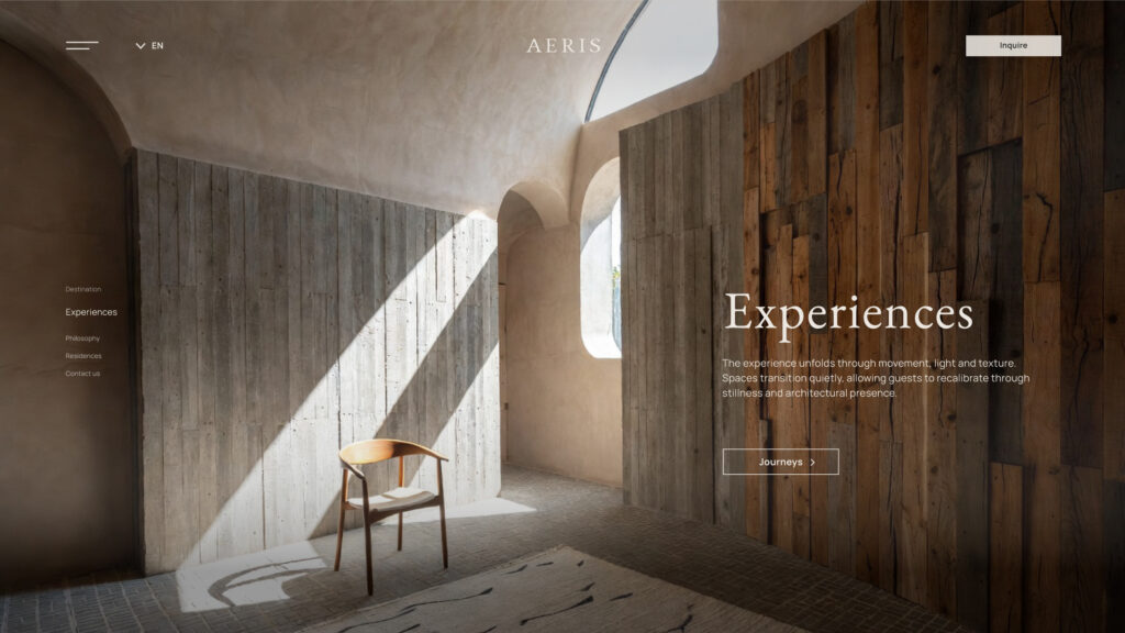
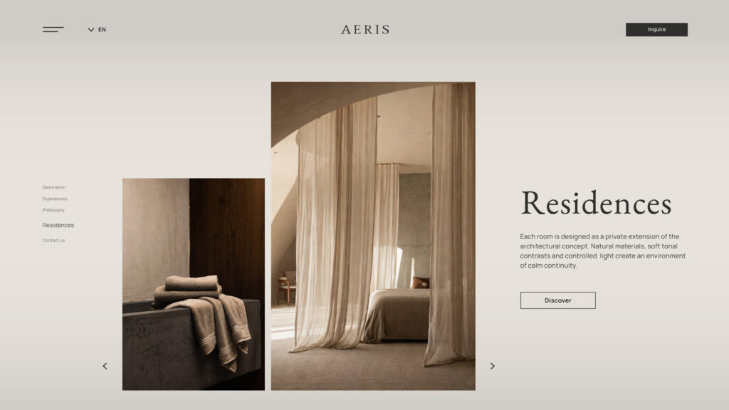
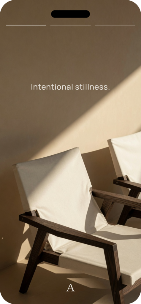
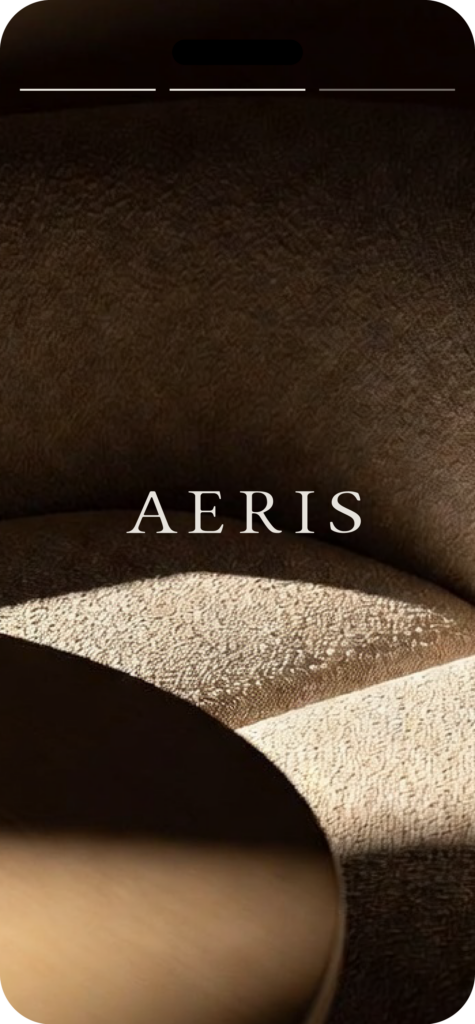
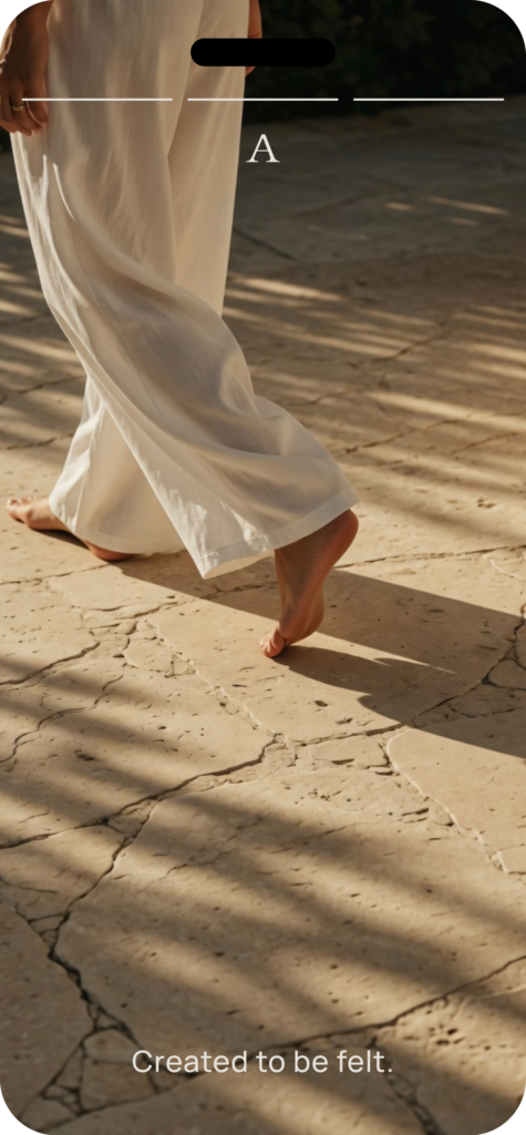
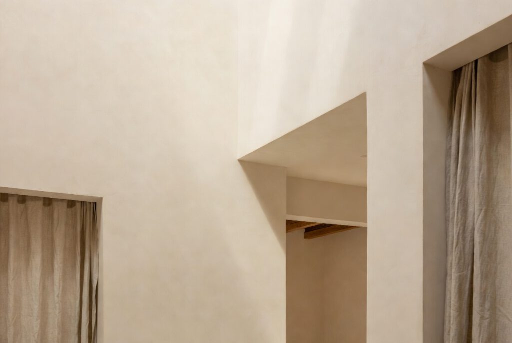
Aeris is an architectural retreat where stillness is treated as an essential part of the experience. Conceived as a place to slow down rather than to impress, it creates space for reflection, presence and a deeper connection with its surroundings.
Challenge
The task was not to create another luxurious retreat identity. It was to express a slower, more conscious form of hospitality.
Calm without emptiness, refined without exclusivity, and timeless without relying on familiar conventions.
Insight
Stillness is not created by adding more. It emerges when distraction is removed.
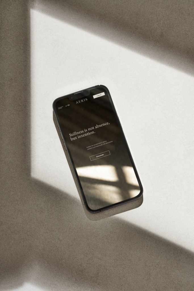
The visual identity translates the quiet character of the retreat into a coherent design language. Through restrained typography,
honest materiality and a muted palette, it supports the architecture rather than competes with it.
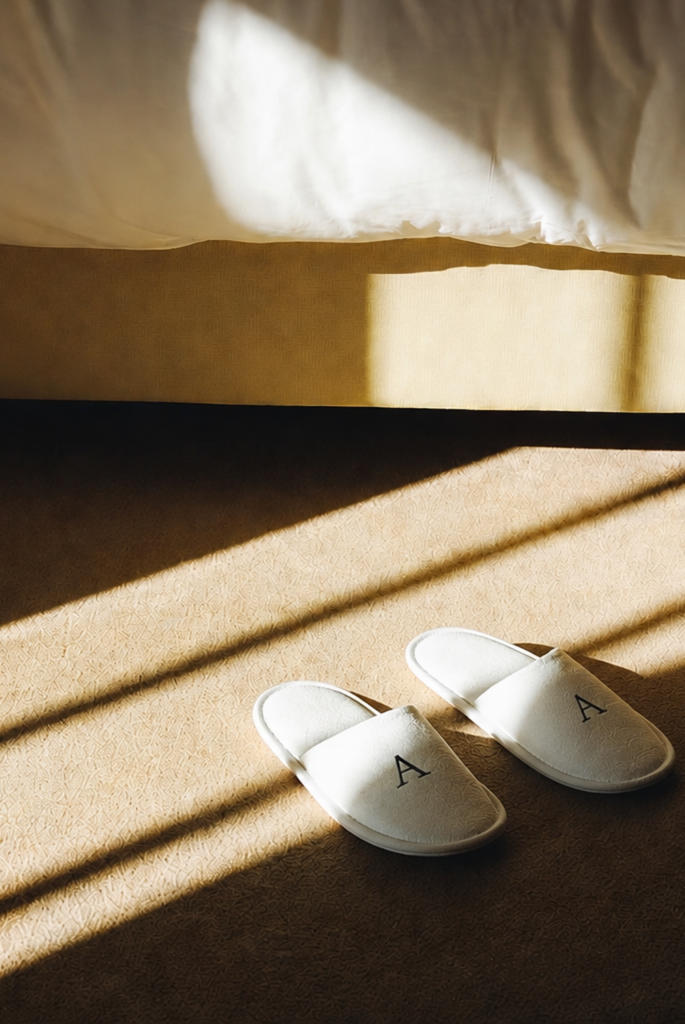
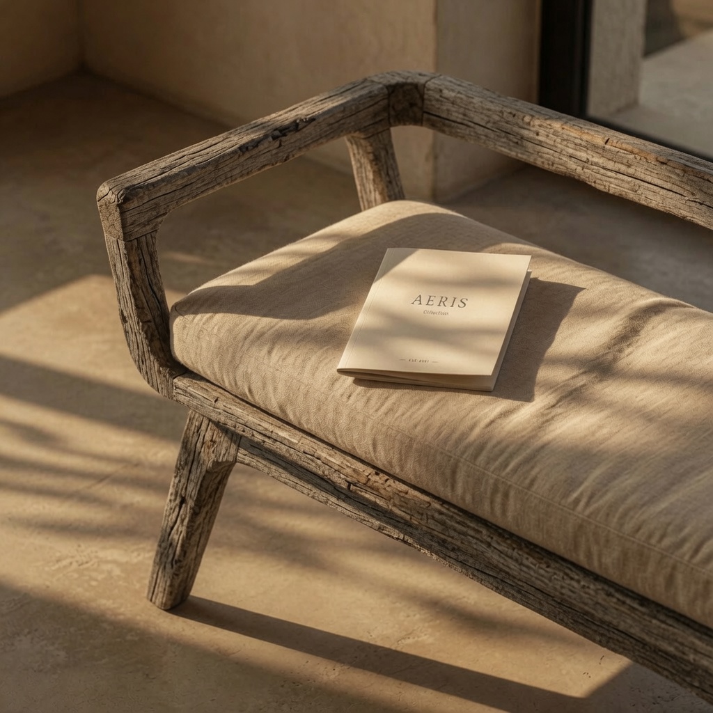
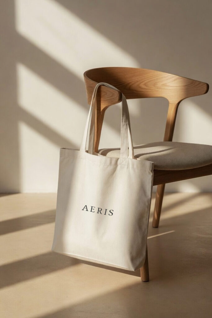
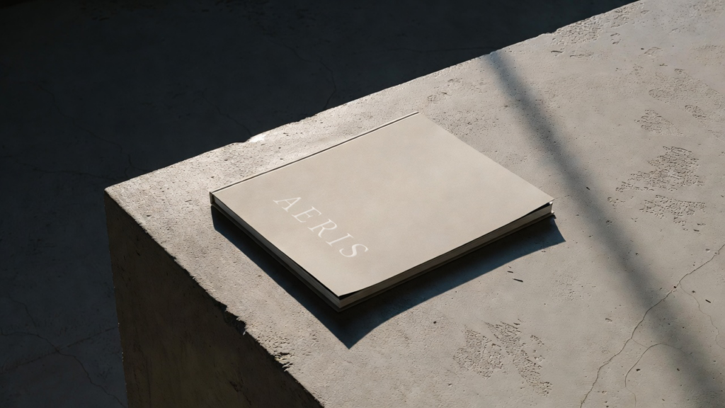
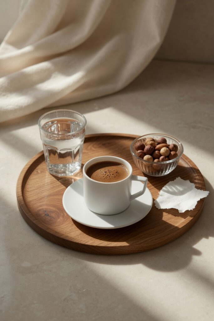
Every touchpoint was designed to extend the same visual language. From printed materials to signage and guest amenities, the identity creates a seamless experience that feels calm, considered and enduring.
Reflection
The identity was never intended to become the defining feature of Aeris. Its role is simply to support the experience—allowing architecture, material and atmosphere to leave the strongest impression.